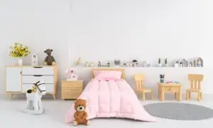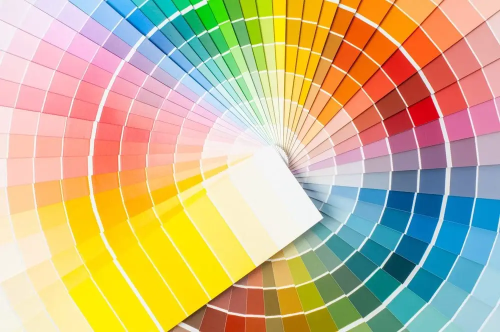
Are your walls beginning to look outdated or just dull? Add some new hues to refresh and update your space with these 5 trending colour palettes in interior design that are guaranteed to make you fall in love again with your home.
Shimmering Sunset Palette
Each year, the Pantone Color Institute announces a colour of the year. For 2019, they picked Living Coral, for its “vibrant, yet mellow” look that “embraces us with warmth and nourishment to provide comfort and buoyancy in our continually shifting environment,” according to the official website. You can find this colour among other pinks, purples, oranges and yellows in the Shimmering Sunset palette. Choosing any one of the bold, energizing colours that are featured in this particular palette can help to liven up an otherwise dull room and to add a little pop of colour to an accent wall.
Colour Trends 2019
Benjamin Moore’s pick of the year was the Metropolitan AF-690, for its adaptive gray hue that offers cool undertones and a calm yet sophisticated charm. The colour is supported by the Colour Trends 2019 palette that’s composed of 15 balanced hues. This includes, Hunter Green, Black Pepper, Hale Navy, and Cloud White, to name a few. It’s a palette that’s timeless and gender-neutral and can work on all walls or rooms.
Wanderer
A palette that pays homage to mid-western flare. The Wanderer colour palette by Sherwin Williams features warm colours like leather browns and caramels, as well as their pick of the year – The Cavern Clay SW 7701 – a cozy shade of terracotta. Harmonious and earthy, these colours can suit a variety of home styles and tastes. You can use them on the exterior to provide a neutral yet unique look, or inside a rustic home alongside stone and wood accents.
Dulux 2019 Trends Colour Palette
Dulux carefully curates a décor trends palette each year. This year’s palette features rich, deep hues like Black Forest, and lighter cool neutrals like Spiced Squash to create a perfect mix of modern and old-school combinations. It’s a well-balanced palette of 15 hues that can be used as feature colours or paired with an accent wall to hang back as a neutral.
Earth Tones
The Behr colour of the year is an inviting blueish-grey tone called Blueprint S470-5 that is one of four standout colours in their Earth Tones palette. Offering warmer tones in taupe and browns, this finely curated palette can be used on walls, exterior surfaces, as well as furniture and decor. They also work incredibly well together to add a splash of colour to anything.
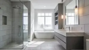
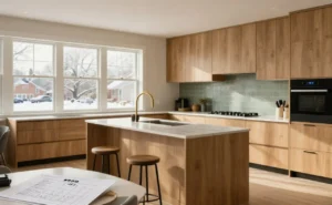
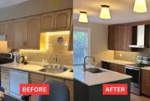
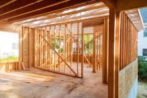
Are you planning a home reno this season? Contact us or give us a call at (613)727-9427 We can provide you with an upfront quote and assist with creating your vision from design to installation. Our crew is knowledgeable, experienced and fully certified to deliver quality craftsmanship and service. For any of your kitchen, bathroom or home reno need, contact the Renosgroup!