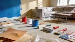
A home is a reflection of your aesthetic sense, a space where you feel free to be yourself, and a place to unwind. Playing one of the most important roles in creating a truly relaxing space is the paint or wallpaper you use. This is especially true in the master bedroom, where choosing the right colour is critical. With that in mind, let’s spend a moment reviewing two competing colour choices. Along with describing how lighter golds and deeper reds differ, we will go into variations of each to further explore the options available. With that, let’s begin!
Golds
Golds are softer, inviting colours that liven up a space, make it appear brighter, and make it even feel happy and youthful. The colour yellow has a lot of connotations in our society, and finding the right tint can make all the difference in the world.
Golds: Warmth and Brightness
Golds exude warmth and vibrancy, making a space feel cheerful and inviting. The inherent optimism associated with yellow, a key component of gold, plays a significant role in creating a positive ambiance.
Beyond the visual aspects, gold is often associated with positive emotions like happiness, creativity, and success. This psychological influence can contribute to a more uplifting and energizing atmosphere in your master bedroom, perfect for starting your day on a positive note.
Choosing the Right Gold Tone:
The key to harnessing the power of gold lies in selecting the perfect shade for your specific needs and preferences. Consider these factors:
- Room size: Lighter shades, such as tame yellow, can visually enlarge a smaller space, while soft gold can work well in both larger and smaller rooms.
- Natural light: Rooms with abundant natural light can handle bolder gold tones, while rooms with limited natural light might benefit from lighter shades like tame yellow to avoid making the space feel closed in.
- Personal preference: Ultimately, the perfect shade is the one that resonates with you and creates the desired mood in your personal haven.

The Soft Gold Look
Soft gold has a classic feel that is nearly impossible to deny. While it creates less of contrast with wood, it still is inviting. Nearly rustic in its application, the soft gold look provides an aged warmth that is hard to replicate in any other way.
The Allure of Soft Gold:
- Classic and Enduring: Soft gold transcends fleeting trends, offering a timeless aesthetic that never goes out of style. This classic hue exudes a sense of sophistication and refinement, making it a perfect choice for those seeking a sophisticated yet inviting space.
- Warmth and Invitation: Unlike stark white or cool grays, soft gold possesses an inherent warmth that fosters a sense of welcome and comfort. This quality makes it ideal for creating a relaxing and inviting atmosphere in your master bedroom, a space dedicated to unwinding and rejuvenation.
- Subtle Contrast: While soft gold may not create a stark contrast with wooden elements like furniture or flooring, this very feature contributes to its charm. The subtle interplay between the warm tones of wood and the gentle gold hue creates a cohesive and harmonious aesthetic, fostering a sense of peace and tranquility.
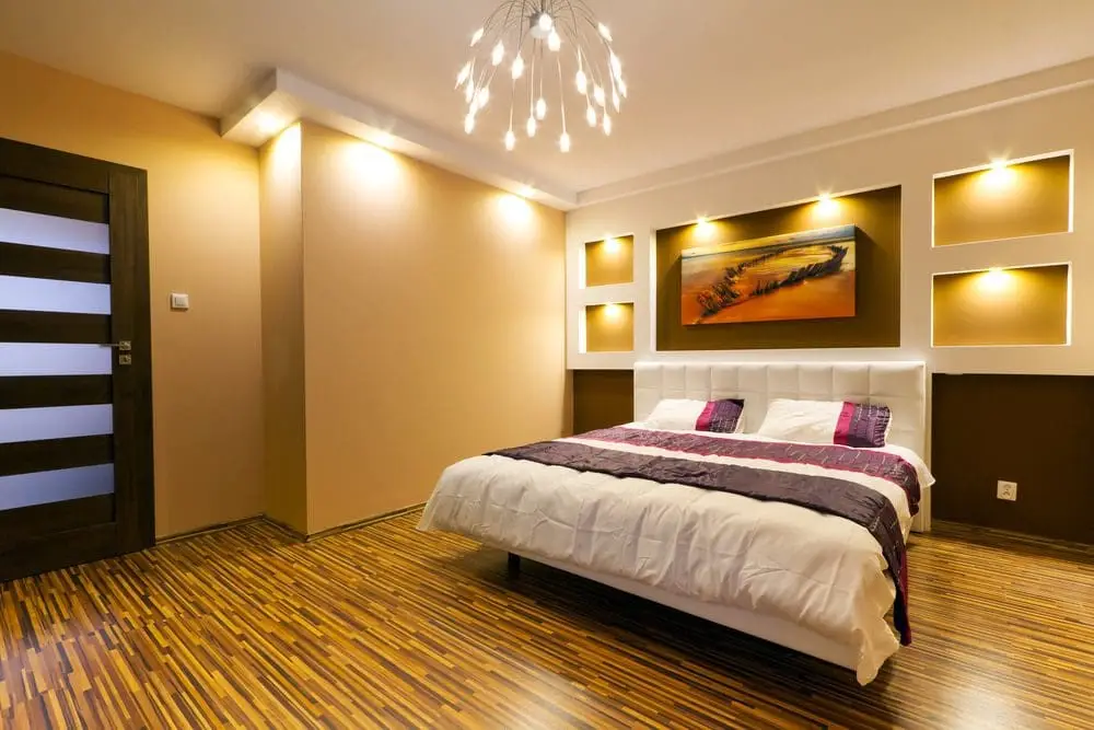
A Tame Yellow
The tame yellow look creates a feeling of openness, airiness, and space. It is warm and inviting. Often going incredibly well with the darker browns of wood borders, windows, and furniture, even a tame yellow is still bright and inviting. With countless classic looks, soft gold is highly versatile.
The Allure of Tame Yellow:
- Warmth and Brightness: Similar to soft gold, tame yellow exudes warmth, instantly brightening your space. This is especially beneficial in rooms with limited natural light, as it can combat feelings of gloominess and create a more inviting atmosphere.
- Openness and airiness: Tame yellow has the unique ability to visually enlarge a space. This characteristic makes it ideal for smaller bedrooms, as it can create the illusion of more square footage and contribute to a feeling of openness.
- Versatility and Balance: Unlike bolder yellows, tame yellow is incredibly versatile. It pairs beautifully with a variety of colors, from crisp whites and calming grays to rich browns and even pops of contrasting colors. This allows you to create a personalized and balanced color scheme that reflects your preferences.
Reds
Reds are perfect for creating a cozy, calm, and inviting master bedroom. Often accented with pillows, decorations, and bronzed metal fixtures, deeper reds draw us in and don’t disappoint. Like with the golds and yellow, success in using deeper reds is all about identifying the right shade for your needs.
The Allure of Deeper Reds:
- Cozy and Inviting: Deeper reds possess the unique ability to create a sense of warmth and intimacy, making your master bedroom feel like a true haven. This quality is particularly appealing in larger bedrooms, where cooler tones might create a feeling of vastness.
- Calming and Relaxing: Contrary to popular belief, deeper reds can actually promote relaxation. Studies have shown that certain shades of red can have a calming effect on the nervous system, fostering feelings of peace and tranquility – perfect for unwinding after a long day.
- Sophistication and Elegance: Deeper reds exude an air of sophistication and elegance that can elevate the aesthetic of your master bedroom. This is further enhanced by carefully chosen accents, such as bronze metal fixtures or plush velvet throw pillows.
Burgundy
Vibrant, burgundy is deep, dark, but still has enough going for it to stand out. With incredible success as a background colour paired with white or a very fine tan, burgundy is often not the only colour used on the walls. Consider your space when considering burgundy as it can be highly specific to the space in your home.
The Enthralling Allure of Burgundy:
- Statement-Making Potential: Unlike lighter colors, burgundy makes a bold and dramatic statement. It instantly elevates the visual impact of your space, fostering a sense of sophistication and elegance.
- Depth and Intimacy: The depth of burgundy creates a sense of intimacy and warmth, making your master bedroom feel like a cozy and inviting retreat. This is particularly appealing for larger bedrooms, which can sometimes feel vast and impersonal.
- Versatility with Accents: While stunning as a background color, burgundy pairs beautifully with other elements to create a cohesive and balanced aesthetic. White or very fine tan accents provide a perfect contrast, preventing the space from feeling overwhelming.
Reddish-Brown
Toned, classy, and mesmerizing, the reddish-brown colour acts like the soft gold in creating an aged yet inviting look. Matched well with darker woods and tan accents on the ceiling, reddish-brown has a lot of potential.
The Allure of Reddish-Brown:
- Sophistication and Elegance: Reddish-brown exudes an air of refinement and sophistication. It instantly elevates the visual appeal of your space, offering a more subdued alternative to bolder shades of red.
- Warmth and Comfort: The inherent warmth of brown, accentuated by the subtle red undertones, fosters a sense of comfort and tranquility. This quality makes reddish-brown ideal for creating a space that feels both inviting and relaxing.
- Timeless Appeal: Unlike fleeting trends, reddish-brown possesses a timeless quality. It seamlessly blends with various design styles, from traditional to contemporary, making it a versatile choice for a long-lasting aesthetic.
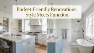
For all your home renovation needs, including choosing the exact right shade and hue to bring your renovation to the next level, RenosGroup is here to help. Contact us, or give us a call at (613)727-9427 for a free, no-obligation consultation and let inspiration guide the way!